Rounding Tab Corners
In the past year or so, it's become somewhat fashionable to use unordered lists to create "navbars;" that is, collections of navigation links.[1] A good example of a navbar is the horizontal stripe across the page tops of this very site, where you can find links to the major areas of Complex Spiral Consulting. In most cases where a horizontal stripe is created, the links are often made rectangular, as they are here. Just to buck the trend, it might be fun to create a "tab" appearance for the links. Let's take a look at how we might accomplish this.
Simple Tabs
In order to lay some groundwork, let's examine the markup used to create a simple three-link navbar for a sports team's Web site.
<ul id="nav">
<li><a href="index.html">Main</a></li>
<li><a href="home.html">Home</a></li>
<li><a href="away.html">Away</a></li>
</ul>
The actual markup for a Web site might be more complicated than this, of course, but we really don't need anything else to demonstrate rounded-corner tabs. We can turn these three links into a set of square white links set against a black background with the following CSS, as illustrated in Figure 1.
#nav {background: black; padding: 5px 10px 2px; margin: 0;
  list-style: none; font: bold 0.8em Verdana, sans-serif;}
#nav li {display: inline; padding: 2px 0; background: white;}
#nav li a {padding: 2px 10px; text-decoration: none;}
#nav li a:link {color: black;}
#nav li a:visited {color: gray;}
 Figure 1. First steps.
In order to round off these links in a cross-browser way, we need to introduce some images. The best thing for us to do would be to drop images into the backgrounds of the links, since that would let us set the curves from the style sheet, and won't require us to insert img elements into the document.
Because the list items are now inline, however, we don't have any way of knowing how wide each link will be. This means that we can't create a single image with the two rounded corners and place it in the background of each link. Instead, we need to put a separate curve image in each upper corner of the tab, using the images shown in Figure 2.
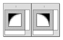 Figure 2. Our curves.
Note that the curve images should be made small enough to avoid being larger than the font size of the links. In this case, we've made the curves 10x10 pixels, since it's unlikely the font sizes plus the top and bottom padding on the links will ever drop below 10 pixels. Now all we need to do is place them in the corners!
Curving the Corners
At the time this article was written, there was no way in CSS to assign more than one background image to a given element. Fortunately, in this case we don't have to, because we have two elements in each tab: the list item and the anchor.
In order to curve the upper corners of the tabs, all we need is to modify these rules from our previous styles:
#nav li {display: inline; padding: 2px 0 2px 10px;
  background: white url(topleft.gif) top left no-repeat;}
#nav li a {padding: 2px 10px 2px 0; text-decoration: none;
  background: url(topright.gif) top right no-repeat;}
By placing one curve in the li elements, and the other in the anchors, we get the result shown in Figure 3.
 Figure 3. Curved-corner tabs.
Because we added appropriate padding to each element (10 pixels of left padding for the list item, and 10 pixels of right padding for the anchor) the images have enough room to avoid the link text "sticking out" of the white area of each tab. If the tabs need to be wider, then a quick padding adjustment will do the trick.
This approach is likely to work in any browser that has the ability to place background images into inline elements and position them within each element. That's most, if not all, browsers released since 1998 or so.
The thing is, we're likely to run into trouble if the tabs aren't meant to be a solid color against another solid color. For example, if the tabs are supposed to have a solid border that follows the curves, we're out of luck. Assuming that we simply added a red border to the li elements, we'd get the result shown in Figure 4.
 Figure 4. Border problems.
We can avoid this problem, but doing so will require some alteration of the HTML source and some fancy steppin'.
Adding a Border
Our challenge now is to add a border to the visible outer "edge" of the tabs. The first step is to add the border effect to the curve images themselves, as shown in Figure 5.
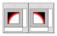 Figure 5. Bordering the curves.
Now, we add a span to each of the links, wrapped around the content of each tab but inside the anchor elements, like this:
<ul id="nav">
<li><a href="index.html"><span>Main</span></a></li>
<li><a href="home.html"><span>Home</span></a></li>
<li><a href="away.html"><span>Away</span></a></li>
</ul>
Now here's where it gets a little tricky. We're going to use a combination of background images, negative margins, and padding to finagle the effect we want. Here's the CSS to make it happen, with the result shown in Figure 6:
#nav {background: black; padding: 5px 10px 2px; margin: 0;
  list-style: none; font: bold 0.8em Verdana, sans-serif;
  border-bottom: 1px solid red;}
#nav li {display: inline; padding: 2px 0;
  border: 1px solid red; border-bottom-color: #FFF; background: #FFF;}
#nav li a {padding: 3px 10px 2px 0; margin-right: -1px;
  text-decoration: none;
  background: url(topright-red.gif) top right no-repeat;}
#nav li a span {padding: 3px 0 2px 10px; margin-left: -1px;
  background: url(topleft-red.gif) top left no-repeat;}
 Figure 6. Bordered tabs.
We've done three things here worthy of note.
- We've set the top padding of both the
aandspanelements to be one pixel greater than the top padding of thelielement. This pushes their tops outside of theli, thus allowing their background images to "mask" the top border set on the list item. - The right and left margins of the anchor and
span(respectively) have been set to-1px, which pulls them one pixel outward on each side of the list item. This again allows their background images to overlap the border on the list item, thus "masking" it. - The white background has been moved to the list item itself, so that it ends up "behind" the background-image corners of the other two elements. Also, the bottom border of each tab has been made white, while the bottom border of the
ulitself is red.
This is, as you might expect, something of a fragile solution. It requires a fairly exacting implementation of the CSS inline layout model; thus, many browsers released before 2001 or so are likely to have trouble handling this in the desired way.[2] With the use of CSS-hiding techniques, however, we could create a situation where the tabs are rounded in browsers that can handle the styles involved, and squared off in those that can't.
For example, very little of what we've discussed here works well, or at all, in Internet Explorer for any platform. This appears to be due to errors in the handling of padding and background images, although very different flaws affect the Windows and Macintosh versions of IE. Therefore, it's probably a good idea to hide such rounding styles from these browsers.
Rounding With Gecko
There is one other possibility for rounding tab corners that doesn't require much in the way of hacks, but it is restricted to the Gecko family of browsers (admittedly, a large and growing family). If you're so inclined, you could use -moz-border-radius, a CSS-like property that allows you to round corners without any images at all, background or otherwise. Here's an example:
#nav li a {-moz-border-radius: 10px 10px 0 0;}
This will cause the top left and top right corners to be rounded along the edge of a hypothetical circle with a radius of ten pixels. In other words, the curve will be basically the same size as the ten-pixel background images we were using before. Thus, the following styles will have the result shown in Figure 7.
#nav {background: black; padding: 5px 10px 1px; margin: 0;
  list-style: none; font: bold 0.8em Verdana, sans-serif;
  border-bottom: 1px solid red;}
#nav li {display: inline;}
#nav li a {padding: 2px 10px 1px; text-decoration: none;
  background: white;
  border: 1px solid red; border-bottom-color: #FFF;
  -moz-border-radius: 10px 10px 0 0;}
 Figure 7. Using Gecko's rounding capabilities.
As we can see, the cornering isn't as smooth as the images we created, which could be a problem. The major advantage of -moz-border-radius is that it lets you use any length measure, not just pixels. We could have made the corners half an em in radius, for example, thus allowing the curves to scale themselves to the font size of the tabs themselves. It is also to be expected that the corner-curving algorithm will get more sophisticated over time, and eventually will result in curves as smooth as those seen in the images.
The other great things about this technique are that it doesn't require structural hacking (no extra span is needed), it doesn't call for the loading of any images, and in browsers that don't support the rounding property will still display the tabs, only with squared corners. This may not be ideal, but it isn't a tragedy: most visitors are used to squared-corner tabs anyway.
Summary
As we've seen, rounding the corners on a "navbar" created from an unordered list is a simple matter of using the elements already in place. If we want to add a border to the visible portions of the tabs, then another element is required, but the markup change is not significant. It may be a touch annoying that a span has to be added, but at the present time, the limitations of CSS require that we indulge in some structural hacking.[3] On the flip side, there is the possibility of using a property that works in a single family of browsers while allowing an acceptable presentation in browsers outside that family.
Over time, we may see further enhancements of CSS that allow for the setting of rounded corners and border effects like those we talked about in this article, but it is not likely that such capabilities will be available any time soon. Fortunately, we can use the capabilities CSS offers us in the present to get the sorts of effects explored here.
- [1] See Mark Newhouse's article "Taming Lists" for a detailed look at using HTML lists in creative ways, including the creation of sidebars and navbars.
- [2] A more robust approach would be to place the curve images in each link and then position them with respect to each link, but that requires a lot more HTML hacking than I wanted to deal with in this article.
-
[3]
Using a technology such XBL or DOM scripting, it would be possible to dynamically insert the needed
spanelements without having to alter the original document's HTML. However, it's a lot simpler to add a few elements to the source than it is to create and run a script to do the same job.