Containing Floats
As powerful and useful as they are, floats can make for tricky layout tools. Chances are that you may have seen something like the situation shown in Figure 1, which is accomplished with just two div elements, each with a floated image inside it.
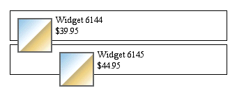 Figure 1. That's not right!
This is probably not what the author had in mind, but given the styles used, it's the correct layout. Here's how we created it:
div.item {border: 1px solid; padding: 5px;}
div.item img {float: left; margin: 5px;}
That's all it takes. The result seen in Figure 1 happens because the div elements don't "stretch" to contain the floated images within them. To look at the situation from the reverse angle, it happens because the floated images "stick out" of the bottom of the div elements.
This is not a bug. It's also not a flaw in CSS. It is, in fact, the behavior that most authors will want most of the time. It's just not what they would want in the example shown in Figure 1.
Understanding the Problem
So when in the name of all that's good and right would authors want floats to stick out of their containing elements? Simple: in what is historically the most common case for float use. Consider Figure 2, and the basic markup structure that produced it.
 Figure 2. Floating an image, flowing the text.
<p>
 ...text...
 <img src="jul31-03-sm.jpg" height="200" border="0" class="picture">
 ...text...
</p>
<p>
 ...text...
</p>
The practice of flowing text around an image goes back a long, long time. That's why the ability was added to the Web starting with Netscape 1.1, and why CSS makes it possible using the property float.[1] But look closely at Figure 2. The floated image is sticking out of its containing element. We can see this more clearly by adding borders to the paragraphs, as shown in Figure 3.
 Figure 3. Adding borders to the paragraphs.
So now we can see why it's important that floats stick out of their containing elements. If they didn't, then Figure 2 would have looked like Figure 4 instead.
 Figure 4. If floats expanded their ancestor elements.
That's something designers would never have accepted. So, in order to keep with Web design tradition and author expectation, CSS is written to allow floated elements to stick out of the bottom of their containing elements. While this is necessary for normal text flow, it's a major problem when floats are used for layout purposes.
A Clear Solution
If floats are to be used in creating non-table layouts, then there needs to be a way to make their containing elements stretch around them. At present, this requires a bit of a structural hack. Since we want the bottom of the containing element to be placed clear past the bottom of the float, then clear is our answer. We need only insert a block-level element just before the end of the container, and clear it. Consider:
<div class="item">
 <img src="w6144.gif">
 Widget 6144
 <br>$39.95
 <hr>
</div>
<div class="item">
 <img src="w6145.gif">
 Widget 6145
 <br>$44.95
 <hr>
</div>
Now we apply the following rules to the preceding markup, and get the result shown in Figure 5.
div.item hr {display: block; clear: left; margin: -0.66em 0;
  visibility: hidden;}
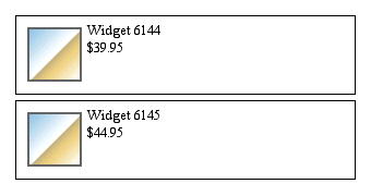 Figure 5. Using a horiztonal rule to force expansion.
By ensuring that the hr elements are block-level, part of the normal flow, and cleared, we force the divs to "stretch around" the left-floated images.
The negative top and bottom margins have the general effect of closing up the space that the hr occupies. However, this effect is not precise, and not necessarily identical across browsers. The semi-mysterious nature of horizontal rules makes it difficult to predict exactly what will happen. The effective height of the hr might be zero, or a small positive amount, or even a negative height.
Therefore, in situations where a precise clearing effect is needed, authors can use a div instead of an hr to create a clearing effect. For example:
div.clearer {clear: left; line-height: 0; height: 0;}
<div class="item">
<img src="w6144.gif">
Widget 6144
<br>$39.95
<div class="clearer"> </div>
</div>
Set a Float to Fix a Float
There is a way to avoid over-use of the structural hacks discussed so far, although they are still necessary at times. In most browsers, and as defined in CSS2.1, a floated element will expand to contain any floated elements that descend from it. So in our widget example, we could remove all of the "clearer" elements and instead write these styles:
div.item {float: left; border: 1px solid; padding: 5px; width: 60%;}
div.item img {float: left; margin: 5px;}
Note that we've floated both the images and the "item" divs. By setting the width of the divs to be greater than 50%, we ensure that they will never be next to each other, but will instead stack up vertically. This has the result shown in Figure 6.
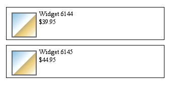 Figure 6. Using floats to stretch around floats.
This is obviously simpler to manage, both in terms of markup and style. However, the hacks discussed thus far are still useful. Suppose you want to put some advisory text underneath the items. In order to keep the text from flowing to the right of the items, we need to insert a clearing hack. This would lead us to create markup like the following, which is illustrated in Figure 7.
<div class="item">
<img src="w6144.gif">
Widget 6144
<br>$39.95
</div>
<div class="item">
<img src="w6145.gif">
Widget 6145
<br>$44.95
</div>
<div class="clearer"> </div>
<p>Widgets are sold on an "as is" basis without
warranty or guarantee.</p>
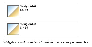 Figure 7. Floats and hacks get the desired layout.
The clearing div effectively pushes the normal flow downward, forcing any following content to flow after the cleared element, and therefore after the floated divs.
The potential drawback to using floats to contain floats is that you rely on browsers to consistently interpret the layout of multiple nested floated elements. The situation becomes more fragile if these floats are part of a more complicated layout, one possibly using floats, positioning, or tables. This is not to say such layouts are impossible to achieve. They may, however, involve a good deal of trial and error to avoid obscure floating and other layout bugs that may lurk inside rendering engines.
Summary
By understanding how floats and the normal flow relate to each other, and understanding how clearing can be used to manipulate the normal flow around floats, authors can employ floats as a very powerful layout tool. Because floats were not originally intended to be used for layout, some hacks may be necessary to make them behave as intended. This can involve floating elements that contain floats, "clearing" elements, or a combination of both.
Looking to the future, there have been a variety of proposed enhancements to CSS that would allow an author to declare that an element should stretch to contain any floated elements within itself. These would obviously be welcome additions to CSS, but as of this writing, support for such abilities is likely to be a long time coming.
- [1] The term "float" refers to the way in which an element floats to one side and down, as described in the original "Additions to HTML 2.0" document that accompanied the release of Netscape 1.1.